Logos

One Green SquareLogo & Business MaterialsLogo Design
|
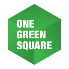
The name One Green Square is rooted in studies that have shown the positive impact of exposure to nature on human well-being. Research suggests that even a simple glimpse of nature through a window can have a significant impact on health, creativity and resilience. Subsequent studies have revealed that the benefits of exposure to nature can be achieved through even a photograph of nature or, intriguingly, even a single green square. This logo design aims to express the depth of these benefits that can be derived from such a simple concept. By extending the flat, green square into a 3-dimensional shape, we reveal a larger volume that is more expansive than the name implies, indicating the limitless potential of nature to improve our health, workflow and creativity. |
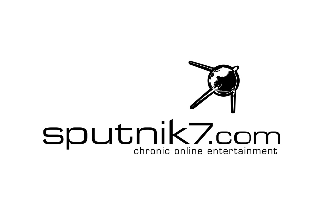
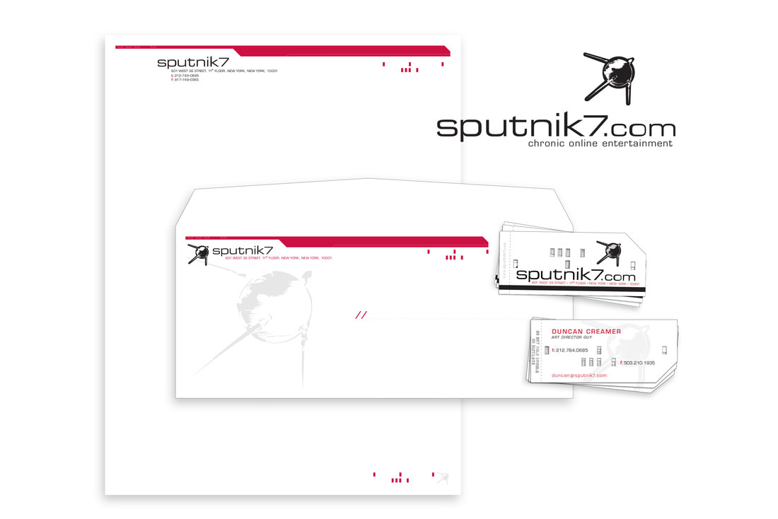
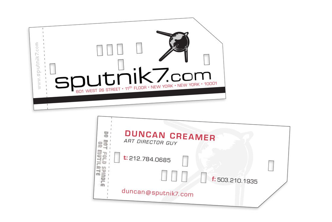
Sputnik7.comLogo & Business MaterialsLogo Design / Letterhead / Business Cards / Promotional Swag
|
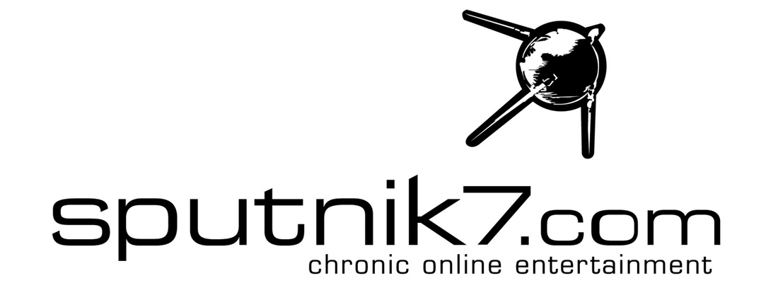
Capturing the essence of a pivotal moment in history, the imagery of punch card computing and the first artificial satellite, the Sputnik7 logo and visual identity serve as a tribute to the forward-thinking pioneers of the past. By capturing the essence of this transformative period, I aimed to create a brand identity that embodied the spirit of a future driven by innovation and creativity.
The business cards were laser cut to emulate the appearance of vintage computer punch-cards, and to add an extra dimension of sensory experience, the tab on the end was perforated, providing a unique tactile sensation when held or placed in a pocket. Despite the unconventional design, the business cards were only slightly smaller than the standard size, ensuring that they would fit easily into regular wallets and card holders. This attention to detail ensured that the branding elements were not only visually striking but also practical and memorable. |
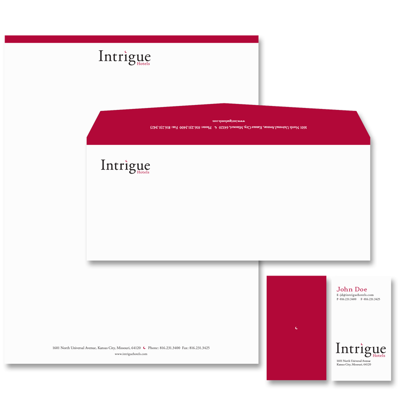
Intrigue Hotel LogoLogo & Business MaterialsLogo Design / Letterhead / Business Cards
|
Following an extensive renovation, a Kansas City hotel embarked on a rebranding initiative. Inspired by a noir theme, the client expressed interest in incorporating a moon iconography to align with the new name. Through a collaborative process, I presented several design concepts to the client before arriving at the elegant and understated final concept featuring a moon gracefully perched atop the letter "i." The resulting logo effectively captures the essence of the noir theme while exuding a sense of sophistication and refinement.
|